Vastu Colors For Your Living Room – In the realm of Vastu Shastra, colors play a pivotal role in shaping the energy and ambiance of a living room. By understanding the significance of colors and their impact on our well-being, we can create a space that not only looks beautiful but also promotes harmony and positive vibes.
This comprehensive guide delves into the principles of Vastu colors, providing insights into the recommended colors for different zones of the living room, as well as guidance on selecting colors for furniture, curtains, and other decor elements. We’ll explore color combinations that suit various living room styles and discuss the importance of avoiding certain color mistakes.
Color Psychology in Vastu
Color plays a pivotal role in Vastu Shastra, the ancient Indian science of architecture and design. It is believed that colors possess specific energies that can influence the mood, behavior, and overall well-being of the occupants of a space.
In a living room, which is a central gathering space in a home, the choice of colors is crucial. The right colors can create a harmonious and inviting atmosphere, while the wrong colors can lead to discomfort or even negative emotions.
Impact of Colors on Mood and Energy
- Red:Stimulating and energizing, red is best used sparingly in a living room as it can become overwhelming.
- Orange:Warm and inviting, orange promotes sociability and communication.
- Yellow:Uplifting and cheerful, yellow brings joy and optimism to a living room.
- Green:Calming and refreshing, green is an excellent choice for creating a tranquil and serene atmosphere.
- Blue:Soothing and relaxing, blue is ideal for creating a peaceful and restful living room.
- Purple:Luxurious and sophisticated, purple promotes creativity and spirituality.
- White:Clean and spacious, white is a versatile color that can be paired with any other color to create a desired effect.
Recommended Colors for Different Zones of the Living Room

The placement of colors in the living room is crucial in Vastu, as it can positively or negatively impact the energy flow. Here’s a detailed breakdown of recommended colors for different zones of the living room, along with the rationale behind each choice:
North Zone: Career and Professional Life
The north zone is associated with career and professional life. Recommended colors for this zone include shades of blue, such as navy, turquoise, and teal. These colors promote calmness, focus, and clarity of thought, which are essential for success in professional endeavors.
South Zone: Fame and Recognition
The south zone governs fame and recognition. Opt for shades of red, such as crimson, burgundy, and maroon, in this zone. Red stimulates passion, drive, and confidence, qualities necessary for achieving recognition and success in life.
East Zone: Health and Family
The east zone represents health and family. Green colors, such as emerald, olive, and sage, are recommended for this area. Green promotes healing, well-being, and harmony within the family.
West Zone: Children and Creativity
The west zone is associated with children and creativity. Choose shades of yellow, such as goldenrod, mustard, and saffron, for this zone. Yellow stimulates joy, optimism, and creativity, qualities that are beneficial for children and those pursuing creative endeavors.
Center Zone: Overall Well-being and Harmony, Vastu Colors For Your Living Room
The center zone represents the overall well-being and harmony of the living room. Earth tones, such as beige, brown, and terracotta, are ideal for this area. These colors promote stability, grounding, and a sense of peace and tranquility.
Choosing Colors for Specific Elements in the Living Room

Vastu Shastra provides guidelines for selecting colors for specific elements in the living room to create a harmonious and inviting space. When choosing colors for furniture, curtains, and other decor elements, consider the following principles:
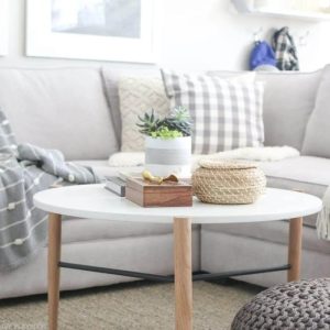
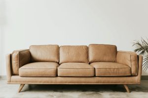
Furniture:Opt for furniture in neutral shades like beige, cream, or white to create a calming and spacious ambiance. Avoid using dark or heavy colors, as they can make the room feel cramped and oppressive.
Curtains
Curtains:Choose curtains in light and airy fabrics like cotton, linen, or sheer materials. Avoid heavy or dark fabrics, as they can block natural light and make the room feel gloomy.
Other Decor Elements
Other Decor Elements:Incorporate pops of color through cushions, throws, and artwork to add visual interest and vibrancy to the space. Choose colors that complement the overall color scheme and create a cohesive look.
Color Combinations for Different Living Room Styles

Choosing the right color combinations for your living room is essential for creating a cohesive and visually appealing space. Different living room styles have their own unique color palettes that can help you achieve the desired ambiance. Here are some examples of color combinations suitable for various living room styles:
Traditional Living Room
- Neutrals and Earthy Tones:Beige, cream, brown, and olive green create a warm and inviting atmosphere.
- Jewel Tones:Deep shades of blue, green, and red add a touch of elegance and sophistication.
- Patterned Fabrics:Floral, paisley, and damask patterns add visual interest and texture.
Modern Living Room
- Monochromatic:Different shades of the same color create a sleek and sophisticated look.
- Neutral and Bold:Pair neutral colors like white or gray with pops of bright colors like yellow, orange, or blue.
- Geometric Patterns:Clean lines and geometric shapes add a contemporary touch.
Contemporary Living Room
- Neutral and Pastel:Soft colors like lavender, peach, and mint green create a serene and airy atmosphere.
- Earthy and Metallic:Combine warm earth tones with metallic accents for a touch of glamour.
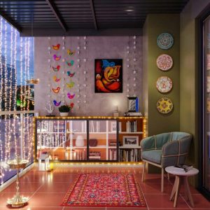
- Bold and Unexpected:Experiment with unexpected color combinations like purple and orange or green and pink.
When creating a color scheme for your living room, consider the overall style, the natural light available, and the furniture and accessories you already have. By following these guidelines, you can create a living room that is both stylish and inviting.
Avoiding Vastu Color Dos and Don’ts
Incorporating Vastu principles into your living room’s color scheme not only enhances the aesthetic appeal but also promotes harmony and well-being. To ensure a Vastu-compliant living space, it’s crucial to avoid certain color combinations and placements that may disrupt the energy flow.
Here are some common color mistakes to avoid in a Vastu-compliant living room:
Colors to Avoid
- Black:Associated with negativity, sorrow, and depression, black should be used sparingly, if at all, in the living room.
- Dark Blue:While blue can be calming, dark shades can create a cold and uninviting atmosphere, hindering communication and social interactions.
- Red:The color of passion and aggression, red should be used judiciously in the living room, as excessive use can lead to tension and conflict.
- Gray:A dull and neutral color, gray can create a sense of stagnation and boredom, making it unsuitable for a vibrant and inviting living space.
- Brown:While earthy tones can be grounding, excessive use of brown in the living room can create a gloomy and depressing atmosphere.
Incorporating Color Trends into Vastu Design
Incorporating current color trends into a Vastu-inspired living room can elevate the space’s aesthetics while maintaining its positive energy flow. Here are some tips for achieving this harmonious blend:
Compatibility of Color Trends with Vastu Principles
Many popular color trends align well with Vastu principles. For instance, the use of earthy tones like beige, brown, and green promotes stability and grounding. Neutral shades like white and gray create a sense of spaciousness and serenity. Jewel tones such as emerald green, sapphire blue, and ruby red add vibrancy and sophistication while still adhering to Vastu guidelines.
Integrating Trendy Colors into a Vastu-Inspired Living Room
- Consider the Zone:Choose colors based on the Vastu zone of the living room. For example, green is recommended for the east zone, representing growth and prosperity.
- Balance Elements:Incorporate colors that correspond to the five elements (earth, water, fire, air, and space). For instance, use blue for the water element in the north zone.
- Use Accent Colors Sparingly:While trendy colors can add visual interest, use them as accents rather than overwhelming the space. This ensures the Vastu-inspired harmony remains intact.
- Experiment with Textures:Explore different textures within the chosen color palette. For example, pair a velvety emerald green sofa with textured beige curtains.
Practical Tips for Implementing Vastu Colors

Incorporating Vastu colors into your existing living room can transform its energy and create a more harmonious space. Here’s a step-by-step guide to help you implement Vastu colors effectively:
1. Determine the Zone: Identify the specific zones of your living room according to Vastu principles. Each zone corresponds to a different element and requires specific colors.
Before-and-After Transformations
Consider the following examples of before-and-after transformations using Vastu colors:
- North Zone (Water):A living room with a dull blue couch and gray walls was transformed with shades of turquoise and white, creating a calming and spacious atmosphere.
- South Zone (Fire):A living room with a dark red couch and black curtains was transformed with warm shades of orange and yellow, enhancing the energy and vitality of the space.
Benefits of Using Vastu Colors in the Living Room: Vastu Colors For Your Living Room

Incorporating Vastu colors into your living room can bring about a myriad of positive effects on the well-being and harmony of the space. These colors, rooted in ancient Indian principles, are believed to create a balanced and serene atmosphere that fosters comfort, productivity, and relaxation.
Vastu colors are said to have a profound impact on our emotions, thoughts, and physical health. By choosing the right colors for your living room, you can create a space that promotes positive energy flow, reduces stress, and enhances overall well-being.
Case Studies and Testimonials
Numerous case studies and testimonials attest to the transformative effects of Vastu colors in living rooms. One study conducted by the Indian Institute of Technology found that participants who lived in homes with Vastu-compliant color schemes reported significant improvements in their sleep quality, mood, and overall well-being.
Another study, published in the journal “International Journal of Environmental Research and Public Health,” found that exposure to certain Vastu colors, such as green and blue, can reduce stress levels and promote relaxation.
Ending Remarks
By incorporating Vastu colors into your living room, you can transform it into a sanctuary of peace and tranquility. Embrace the wisdom of this ancient practice to create a space that nurtures your well-being and brings joy to your daily life.
FAQ Section
What are the benefits of using Vastu colors in the living room?
Vastu colors can promote harmony, balance, and positive energy in the living room. They can create a sense of spaciousness, enhance mood, and improve overall well-being.
How do I choose the right colors for my living room according to Vastu?
Consider the direction of the living room and the energy associated with each zone. For example, the north zone is associated with water, so blue or green colors are recommended. The south zone represents fire, so red or orange colors are suitable.
What color should I avoid in the living room according to Vastu?
Dark and dull colors, such as black or gray, are generally discouraged in Vastu as they can create a heavy and negative atmosphere. Avoid using too much red in the living room, as it can be overstimulating.


Leave a Comment